“Style” Section
First Impression & Usability Study
May 2023
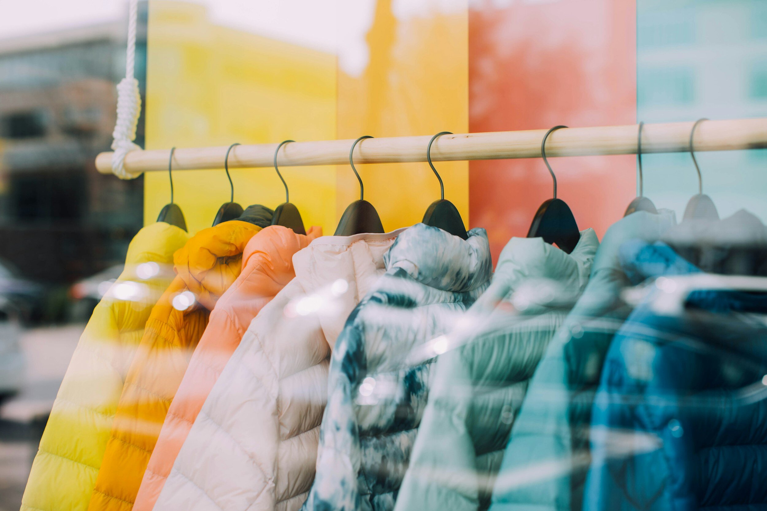
Neiman Marcus, an American integrated luxury retailer
Company
Stakeholder
Senior Product Manager
Role
Lead UX Researcher, with the assistance of a Support UX Researcher
20-minute unmoderated first impression/ usability tests completed by 12 participants
Method
UserTesting, Microsoft Teams, Excel, Google Sheets, Google Slides
Tools
Timeframe
4 weeks
Study Overview
Research Objectives
Neiman Marcus has a section within their consumer app called ‘Style’. This section showcases 'Looks cards', curated assortments of items recommended by Neiman Marcus to complement previously purchased or saved items. Following the redesign of this section, the primary objective was to gather initial feedback and to ensure the design made it easy to edit, shop, save, and share ‘Looks cards’.
Methodology
Method
Unmoderated usability sessions were conducted on the UserTesting platform with a cohort of 12 participants. The unmoderated sessions focused on gauging initial impressions and usability of the prototype 'Style' section. Participants interacted with the section and were prompted to share their experiences and verbalize their thought processes while attempting to complete assigned tasks.
Following a kickoff call aimed at grasping the stakeholder’s goals and objectives, the initial action involved formulating a set of Research Questions. These questions were crafted to pinpoint specific areas for investigation, guiding the research process and data collection efforts. Given the stakeholder's interest in gauging initial impressions of the ‘Style’ section and assessing the usability of editing, shopping, saving, and sharing ‘Looks cards’, the following Research Questions were developed:
First Impressions
What are the participants’ overall impressions of the ‘Style’ section of the app?
Usability
Do participants understand the features and benefits of the ‘Style’ section?
Do they understand the features within individual Looks cards (i.e., AddSave, Share, and Shop)?
How clear are the ways in which you can edit a Look?
How easy is it to edit a Look?
What, if anything, would improve the experience with the ‘Style’ section functionality?
These questions served as a foundation for shaping the inquiries and tasks posed to participants during the subsequent unmoderated sessions.
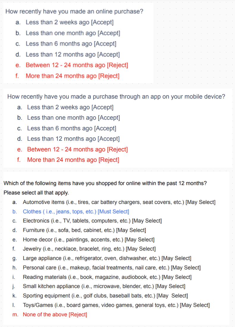
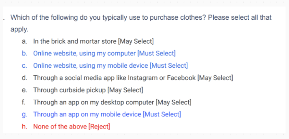
For unmoderated tests conducted on the UserTesting platform, traditional recruitment methods were unnecessary to identify suitable participants. Instead, I formulated screener questions designed to automatically screen participants on UserTesting.com. These questions were based on both their demographic profiles and their responses to specific inquiries.
The screener questions (shown in the screenshots below) were crafted with the following criteria in mind:
Use apps to shop
Shopped online for clothes in the last 12 months
Made a purchase of over $300 from an approved list of brands in the last 12 months


Test questions & tasks
Analysis
Metrics
Session Transcripts
Rainbow Spreadsheet
Top 10 Findings
Findings
Impact

Test Plan excerpt from Google Docs
Tasks and follow-up questions
Participants were asked to complete specific tasks to aid in evaluating the usability of the ‘Style’ section. Within the section users can edit Looks through swapping, adding, and deleting. Additionally, they can save and share Looks cards. All of these features I wanted to test, and therefore I created tasks around these focuses.
After each core task, participants were asked if they were successful in completing the task and then to rate:
Clarity of the design in knowing how to use the feature to complete the task.
Ease of use of the feature involved.

Test Plan excerpt from Google Docs
Throughout the test, care was taken to avoid leading questions and biased questions. I focused on asking "why" and getting at the heart of users needs.
Integrating a combination of qualitative and quantitative inquiries across the test plan aided in simplifying the analysis procedure. Upon the completion of all 12 sessions, I transferred both the qualitative data (session transcripts) and the quantitative data (metric ratings) from an Excel Workbook (generated from the UserTesting Platform test) to Google Sheets. This facilitated collaborative work between myself and the supporting UX Researcher involved in the project, allowing us to work concurrently from a shared place.
Research Questions
Participants
Test Details
Screener Questions from Google Docs
These screener questions were exclusively displayed to participants in the panel who self-identified as female and reside in the United States. Furthermore, participants were segmented into two distinct audiences:
Group 1: Participants aged 18-30 (n=6)
Group 2: Participants aged 31-65 (n=6)
This division aimed to understand how experiences varied between different age demographics.
The subsequent phase involved determining the tasks and questions to include in the test plan in order to address the research objectives. With a focus on capturing initial impressions, the decision was made to present participants with the prototype and gauge their interpretation of the ‘Style’ section before providing any additional context. As such, the test plan was broken up into the following sequences:
Free exploration and first impressions
Participants were presented with the new ‘Style’ section of the app and were instructed to spend a minute exploring it. Following this, they were prompted to share their initial impressions, including their thoughts on the intended purpose of this section.
Ratings from the follow-up questions for each task created a straightforward identification of tasks with the highest and lowest clarity of design and ease of use.
As depicted in the image below, the feature for adding items to a Look received the lowest clarity rating among the features assessed, whereas the feature for adding an item to a bag from a Look had the highest clarity rating.
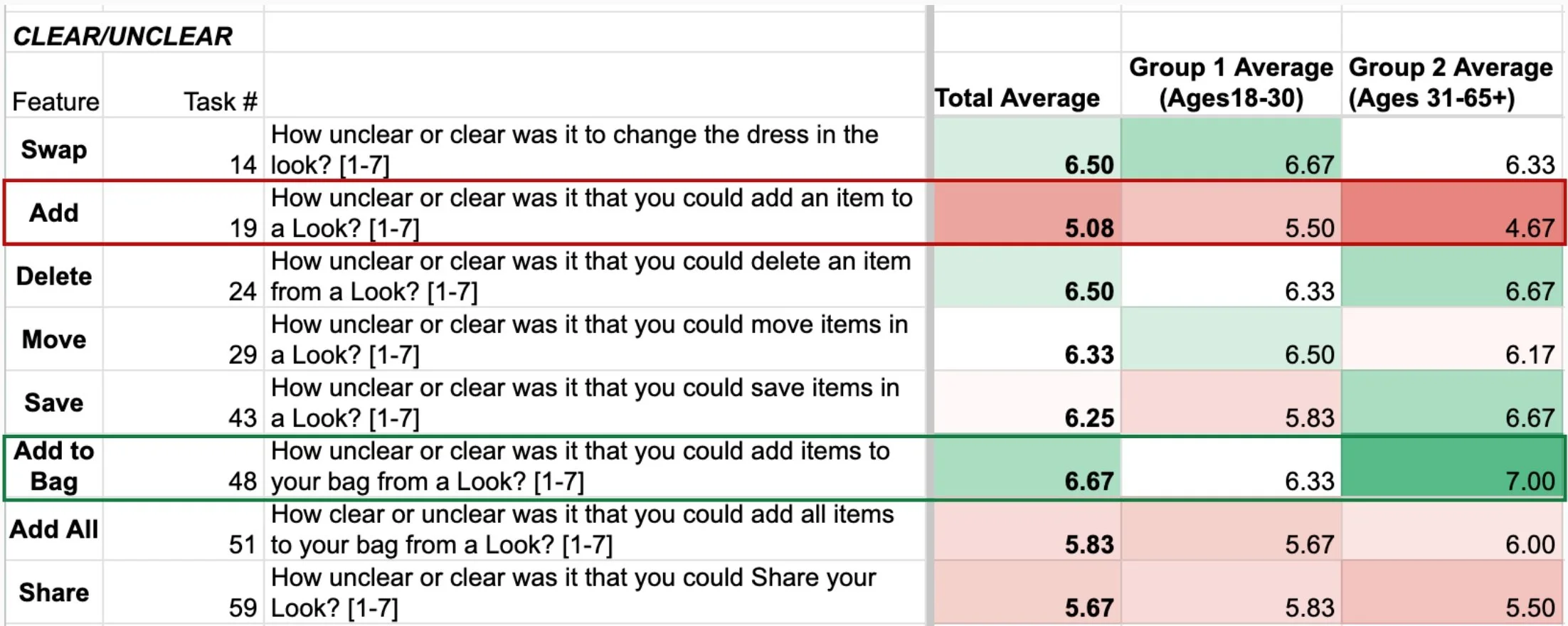
Metrics excerpt from Google Sheets
Although the quantitative data provided valuable insights into which features needed attention, it fell short in uncovering the underlying reasons behind the clarity or confusion associated with using specific features to complete tasks. To delve deeper into this aspect, I relied on transcriptions from the sessions. Analyzing participants' explanations for the ratings they provided enabled me to understand the 'why' behind their perceptions.
For instance, it became evident from participants' explanations that the 'Add' feature was unclear due to confusing instructions that intermittently appeared on the screen. Several participants expressed the need for clearer instructions in the instructional bar to guide them on how to add an item.

Annotations excerpt from Google Sheets
To deepen our understanding, I opted to use a Rainbow Spreadsheet to document participants' behaviors. I divided the 12 sessions evenly and allocated sessions for review between myself and the other Researcher. We were instructed to color a participant's cell whenever a specific behavior occurred. This approach enabled us to later use the spreadsheet to find patterns in our observations. The end result provided us with a colorful visualization of behavioral patterns.
Using the Rainbow Spreadsheet, it became apparent that participants encountered hesitation in determining where to initiate the process to access the Add feature. Additionally, it was observed that some participants, particularly those in group 2, did not perceive the long tap required to access the feature as intuitive.
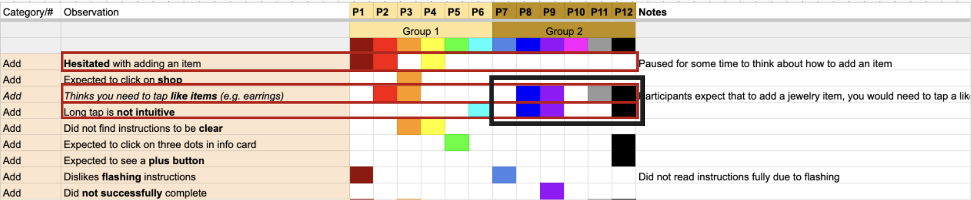
Excerpt from the Rainbow Spreadsheet
The final stage of my analysis entailed meeting with the other Researcher to exchange insights from the sessions we individually reviewed, ensuring mutual comprehension of our observations. This collaborative discussion aimed to identify any commonalities or disparities in our findings. Once we reached alignment, we engaged in a brainstorming session to identify what we perceived as the most significant findings arising from our research. Together, we prioritized the most crucial findings (highlighted in green) followed by the secondary important ones (highlighted in yellow). These findings served as a guiding framework for drafting the research report.

Excerpt from the Top 10 Findings
Outcome
Overall, the analysis validated that most participants thought the Style section was a useful way for shoppers to customize their looks, explore new styles and items, guide purchase decisions, and visualize outfits. However, some improvements could make the features of this new section even more clear and intuitive. The research report deck was divided into the following sections:
Key Insights
Detailed Findings
First Impressions during the initial App exploration
Usability Findings for tasks of editing, shopping, saving, and sharing ‘Looks cards’ and individual items.
Experience impacts of each feature assessed
Within each section, slides were utilized to present an explanation of the respective finding, accompanied by a relevant screenshot of the prototype under discussion. Furthermore, I extracted key quotes and curated highlight reels to illustrate prominent themes within the final deliverable.
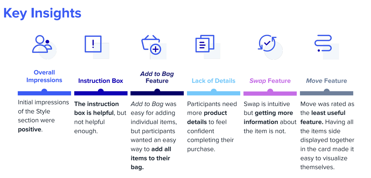
Key Insights Slide


Example Slides
The final deliverable deck was first shared with the main stakeholder before being presented to the larger product team. My comprehensive analysis pinpointed key opportunities, enabling the product team to prioritize essential elements for improving the user experience of the new ‘Style’ section. Not only were all findings given a severity rating (low impact, medium impact, or high impact), but they were also coupled with a recommendation on how each finding could be improved.

Example Experience Impact Slide
The favorable initial impressions of the ‘Style’ section, serving as a platform for shoppers to explore new styles, customize their looks, and visualize outfits, prompted another partnership with the Stakeholder to test to a Proof of Concept of a Virtual Styling experience.
