
Power Automate
Benchmark Study
September 2023
Fortune 15 Information Technology Company
Company
Stakeholder
Product Manager/ Senior Research Manager
Role
Lead UX Researcher
10 Moderated Interviews comprised of Usability Testing and Surveys
Method
UserTesting, User Zoom, Microsoft Teams, Google sheets, Powerpoint
Tools
Timeframe
6 weeks
Study Overview
Research Objectives
This study aimed to help the Fortune 15 Information Technology Company understand the pain points for new users around the product’s key functionality when it came to building and running automation flows.
The goal was to conduct a baseline benchmark for the desktop version of the product and identify areas to improve the user experience.
Methodology
Method
Moderated 90-minute interviews on the UserTesting platform. During the sessions, participants had remote access to the moderator’s machine to complete tasks using the desktop console environment.
Recruitment Details
After hosting a kickoff call to understand the stakeholder’s objectives, the first step was to begin recruitment. With the help of one of our Research Operation Specialists, we began creating screener questions to screen participants through UserTesting.com using the following criteria:
Work full-time and take the initiative to improve inefficiencies in their work processes by using digital tools/solutions (e.g. applications, macros, automations, etc.)
Need to automate business processes and have created/ tried creating automations in the past with automation software, but have never used Power Automate.
Participants were further divided into two audiences (“Tech Savvy Makers” or “Less Tech Savvy Makers” *) to understand how experiences varied.
*Determined by internal definitions.
Test Details
The sessions were broken up into the following sequences:
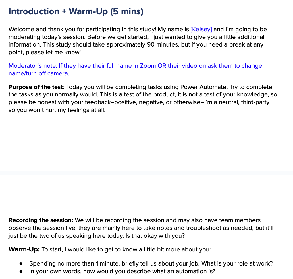
Introduction + Warm-Up
Core Tasks
After each core task:
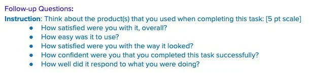
Participants were asked to provide subjective measures (Satisfaction, Ease of Use, Visual Appeal, Confidence, and Responsiveness) *
Moderator tracked objective measures (Success/ Failure and Time on Task)
3. Final Survey Questions
Participants were asked about overall system measures (Satisfaction Score and Summative questions)) *
4. Wrap-Up
*Metrics questions were designed by the company and are used for internal Benchmark Studies
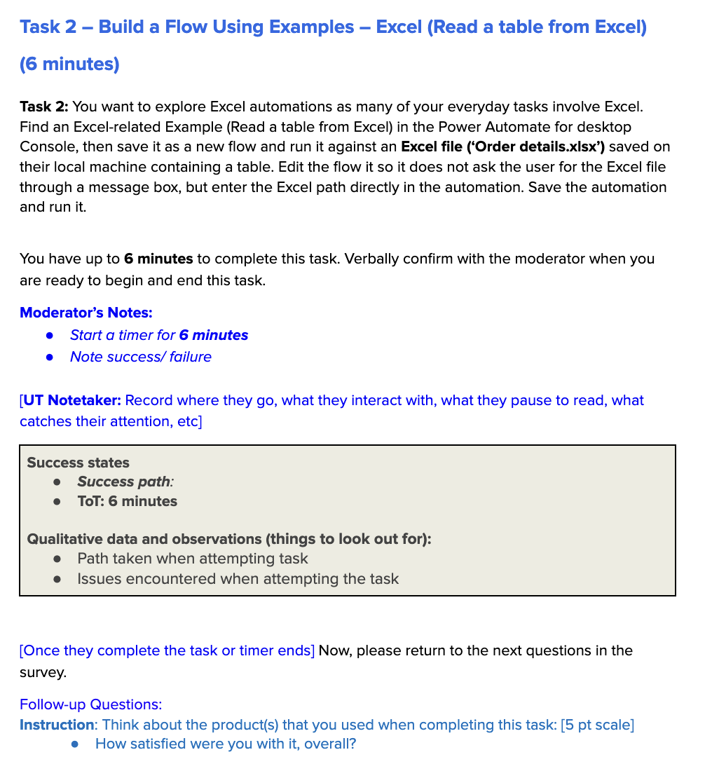
Discussion Guide
The next step was to write the script for the moderator, instructions, success states, and success path for each task, and metrics questions that would be asked after each task. Collaboration between myself and the Stakeholder resulted in the final discussion guide that was used in the moderated sessions.
Care was taken to avoid leading questions and biased questions. I focused on asking "why" and getting at the heart of users needs.
Discussion guide excerpts from Google Docs
Analysis
The following is an annotation sheet excerpt from Google Sheets, which I used to uncover themes. Sessions were transcribed and for each task, the following information was recorded in the annotation sheet:
Paths participants took (removed from image below).
Whether or not the participant successfully completed the task, which was based on participants reaching the specific success state within the allotted amount of time.
The amount of time it took the participant to complete the task (if successful).


Annotation sheet excerpt from Google Sheets
My process involved analyzing paths taken for each task. This was combined with an exploration of the underlying mental models influencing paths taken and other qualitative data to understand the why behind participants’ pain points. Recording the path taken by each participant for each task allowed me to create pathing visuals for each task, and below is an example of one of these visuals.
Excerpt of a task pathing visual from Google Sheets
These visuals were not only requested by the Stakeholder to appear in the final report (see below for example), but assisted me in finding any patterns, such as:
If multiple participants took alternative paths to complete a step (marked in yellow), which would lead me to dig deeper to understand why that path stood out more.
Where the majority of participants became unsuccessful in the task (marked as ‘timed out’) and to see if either of the two groups were more successful in completing the task (visualized by more green vs red). Here, all participants were unsuccessful in this task, yet, 4/5 Tech Savvy Makers (blue) were able to successfully get to step 5, whereas 5/5 Less Tech Savvy Makers (orange) timed out before this step.

Example of pathing visuals incorporated into deliverable slides
All ratings for the subjective measures for each task along with success states for each participant were put into an Excel spreadsheet which we referred to as the ‘scorecard’ (see below) to understand which task(s) had the highest/ lowest satisfaction, ease of use, visual appeal, confidence, and responsiveness score (which was determined by the number of participants who rated the measure as a 4 or 5 out of 5).
Additionally, I calculated the percentage of participants who passed each task (based on the number of participants who were successful in the task, divided by the number of participants who attempted each task) and the experience score for each task (determined by the average percentage of all five subjective measures). These two metrics allowed me to see if any tasks had a higher experience score but a lower pass percentage, which might indicate interesting findings such as participants being satisfied with the task or finding the program easy to use. Seeing such a discrepancy would result in further analysis of that task to better understand why participants gave those higher ratings despite being unsuccessful in completing the task.

Metrics Scorecard from Google Sheets
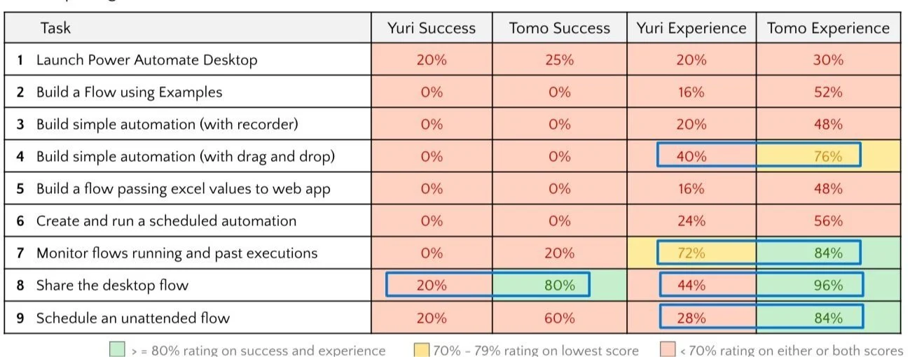
As it was important to find any differences between the two audiences (“Tech Savvy Makers” or “Less Tech Savvy Makers” ) to understand how experiences varied, I further analyzed the above metrics to show any major differences in success (A) or experience scores (B) in the final deliverable. With experience scores especially, it was easy to see that the more tech savvy makers (Tomos) were able to work slightly further through more tasks, giving them more confidence than the less savvy makers, who were frustrated with getting started in the product. These less savvy makers felt like they were failing, giving them a poorer experience.
A
B
Example of metrics scorecard incorporated into deliverable slides
Outcome
Findings
The analysis validated that the first-time experience of Power Automate was challenging for all participants, especially when it came to ease of use, functionality, and navigation. While both audiences struggled to complete tasks successfully, the more tech-savvy makers were better at navigating the product with extended use, and they felt that with more time to learn it, the tool would be very useful to them, especially for everyday Excel tasks.
Overall, the biggest findings that came from this study were that new users need more hand-holding when learning the product and would like to see more examples/ demos/ tutorials that would walk them through the process of setting up common tasks.


Executive Summary deliverable slide
Executive Summary deliverable slide
The final deliverable deck was first shared with the main stakeholder before being presented to the larger product team. My comprehensive analysis pinpointed key opportunities to enable the product team to prioritize essential elements for improving the user experience for new users. Not only were all findings given a severity rating (showstopper, issue, highlight, or data point), but they were also coupled with a recommendation on how each finding could be improved.
In the future, metrics and scores received from this benchmark will be compared against other benchmark studies to measure impact of changes made based on this study.
Impact

Severity scale used in deliverable slides

Recommendation deliverable slide
Lessons Learned
Bringing the stakeholders in to interviews and synthesis allowed them build confidence in my findings and they could raise any red flags/considerations then and there, instead of waiting until the final presentation.
Sharing high-level findings early and frequently with stakeholders helped ensure there were no "surprises" during the final shareout.
Don’t start fire! You need a strategy to deliver “bad news” - and it takes practice